Via Wonk Room’s Zack Ford, a tragi-comedy.
The tragedy is the situation reported by Caitlin Ryan of the worthy Family Acceptance Project at San Francisco State. Two-thirds of LBGT young people rejected by their parents attempt suicide. The numbers for drug abuse and risky sexual behaviour are almost as bad, though oddly not for alcohol.
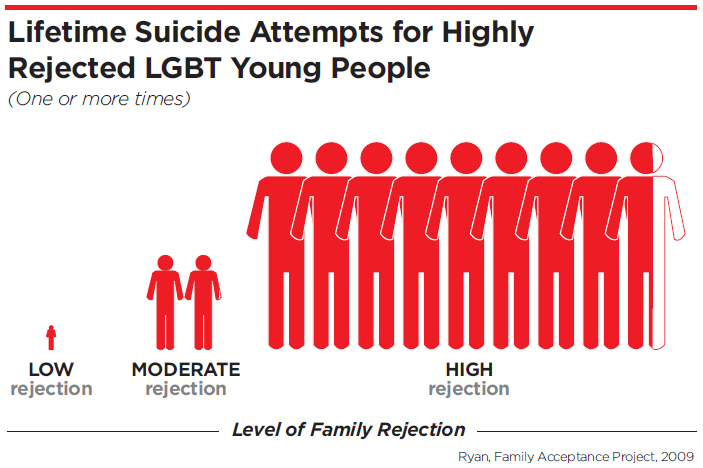
The comedy is the graph of the finding supplied to Wonk Room, an incredible multiple train wreck.

I don’t think I have ever seen a worse chart. It’s not so much misleading as an explosion of confusing messages. As with the Romney logo, somebody worked very hard with a graphics program to produce the catastrophe. How on earth are we supposed to parse the quantitative information:
* counting the stick figures, ratio 1: 2 : 8.5 ?
* or the heights on the vertical axis, ratio about 1 : 3 : 8 ?
* or the widths on the horizontal axis, ratio about 1 : 8 : 43 ?
* or follow the total area of the silhouettes, ratio very approximately 1 : 25 : 330 ?
[Update: Commenter Paul points out below that we can also interpret the figures three-dimensionally, estimating body volume or weight. This makes the increase cubic not quadratic.]
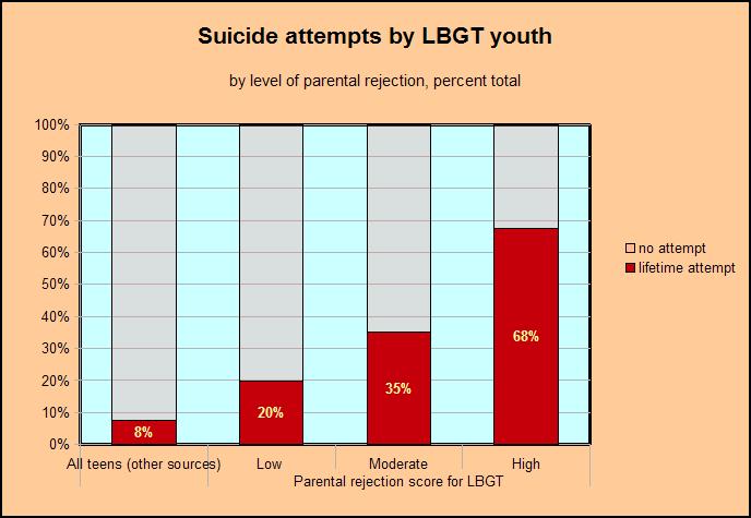
It gets worse. We’ve naturally assumed that the stick figures represent numbers of attempted suicides, and their ratios (whichever) represent the relative risk. But here are the raw data, taken from table 4 in Ryan’s article in Pediatrics, statistical apparatus removed. I’ve added for your enlightenment a rough estimate of the baseline risk of attempted suicide (footnote).
None of the ratios in the chart correspond to anything in the data. What on earth is going on?
Digging around - the RBC never sleeps or rests - I found the answer in the statistical apparatus attached to the original table. The 1 : 3 : 8 ratio - the height of the stick figures - corresponds to the calculated odds ratios of moderate and high parental rejection against low.
The OR is a non-intuitive item in the statistical toolkit, used instead of the more intuitive relative risk because it’s mathematically tractable. It approximates the latter only for low absolute risks, which is not the case here. Really the OR should never be used in a chart to convey the sizes of an effect, especially without explanation. [Update: the OR is misinterpreted in the article, not just in the PR chart: the high-rejection group “were 8.4 times more likely to report having attempted suicide..” So much for peer review.]
The chart also manages to leave out two very important pieces of information.
One is the baseline risk in the general population of young people. My number is pretty rough, but it certainly looks as if even parental acceptance does not protect LBGT young people fully from the stresses of their condition. The baseline includes straight young people rejected by their parents for other reasons, so the parent-free LBGT effect is probably stronger than the doubled risk indicated by the raw numbers.
The second item is however as clear as day in the data table. It’s not just the steep relative risk ratios. As far as the chart goes, we could be talking about risks of 2%, 6%, and 16%. Not so. The absolute risk is extraordinarily high: 68% for kids facing radical rejection from parents. This is the true headline number. Despair is their norm.
I’ve put these together, using the bog-standard kit in OpenOffice, to make a chart that makes sense. Ideally I would have changed the colours for my added baseline data, but that would have meant reworking the chart in a graphics program, and I wanted to show that the basic tools are perfectly serviceable.

It’s tough on the estimable Ms Ryan, but her chart is so miraculously bad that it should become a textbook example of how not to do it. I do invite the students of her handiwork, after laughing, to think a moment about the mountain of pain it tries and fails to portray.
Footnote
I took the 2004 annual US rates of youth suicide by age group from the CDC and added them up to Ryan’s cutoff at age 22, giving a cumulative total of 77 per 100,000. The CDC estimates attempted suicides as 11 times actual overall, but concedes that the ratio is higher for children and young people. For Oregon in 2004, there were 920 recorded suicide attempts by minors under age 17 requiring emergency hospital treatment against 10 fatal attempts in the same group. I use this conservatively high ratio of 92 to be sure of not overstating the LBGT factor. This gives 7668 per 100,000 or 7.7%.
Thanks for the analysis. An open question, which I take it the underlying data does not show, is whether there are differences among homosexual, bisexual, and transgender youth. Is it purely the rejection rate that is the factor regardless of the cause? Are trans youth at a higher risk than bisexuals? I presume so, but the data would be nice to see. The LGBT political alliance may make sense, but the risk factors are unlikely to be equal.
Here’s a counter-example of competent visual display of quantitative information.
Another question, of course, would be whether the risk AND the rejection were both correlated to some third variable, such as behavioral problems. That’s the problem with correlations; They really don’t prove causality. (Yes, I’m a real XKCD fan.)
Yeah, so many LGBT kids have behavioral problems that developed in a vacuum apart from the oppression they face. We cannot infer this data has anything to do with a society that uses religion and other means to condemn people who don’t fit its constructed gender norms. Nope.
By the way, Mr. Wimberley, great graph, I will use it on a discussion board for a class. Thank you.
P.S.
“Our survey instrument also included measures of 9 negative health indicators, including mental health, substance abuse, and sexual risk.”
You need to either pay or have university access to read the article the data comes from, for anyone who is actually interested.
FuzzyFace: the researchers actually dropped their transgender sample as too small, so the findings are about LGB youth only. It’s no doubt even worse for transgender young people. The researchers only found a weak gender effect - capturing the L - G distinction but not B: four or five percentage points of rejection more for boys. Follow my link to the article. A priori bisexual kids would be better off as the parents can tell themselves “it’s only a phase”.
Brett: You are right about the xkcd chart, I emailed it to a few people when I first came across it.
As for “behavioural problems” explaining the numbers: what, at five times the incidence in the straight population, and given that sexual orientation is pretty independent of social and cultural variables?
Can a “bebavioural problem” count as a true cause of anything? The category looks like a grab-bag of symptoms to me. Suicidal impulses, alcohol and drug abuse, and risky sexual activity are behavioural problems all right - and what Ryan is trying, pretty convincingly, to explain. Does she really need to spell out that losing the love and respect of their parents makes kids very, very unhappy?
The causes of any patterns of juvenile behaviour have presumably to be found in the hoary nexus of heredity, family, peers, schools, resources, and values.
Looking at the original table, isn’t it a bit strange that suicide attempts are about 50% more common than suicidal ideation, in all three rejection categories?
I think you’re not being hard enough on the original. for implicitly three-dimensional objects such as figure silhouettes there’s a strong tendency to attribute not just area but volume. So, conservatively, 1:75:1000. But in any case, negligible:not-so-negligible:inconceivable. As opposed to the actual significant:alarming:horrifying.
Paul: I’ve added your excellent 3D point to the post as an update. The overlap of the silhouettes on the right encourages the 3D reading.
Your three-point capsules bring out another effect of the failed charting: it makes moderate parental rejection look more or less OK. It isn’t. As you say, a 35% risk of attempted suicide is at least “alarming”.