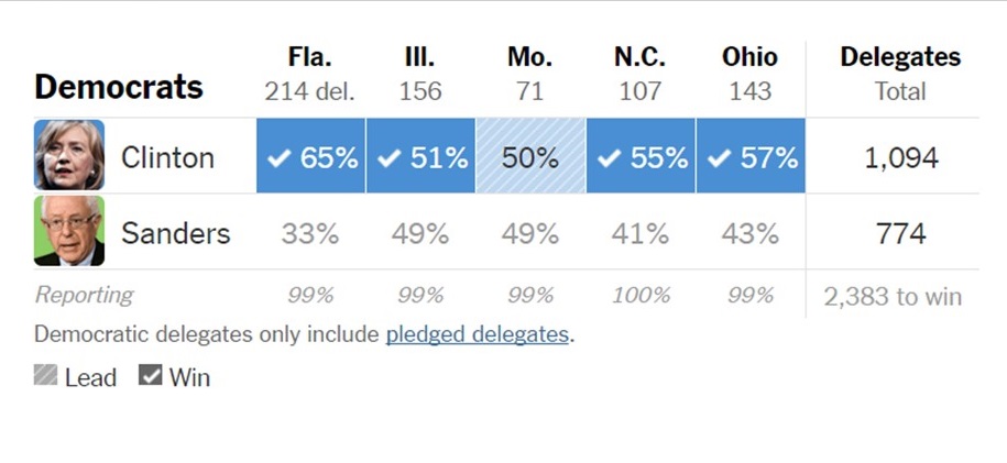
Here are last night’s Democratic results as displayed on many websites. The strangeness of this format is how deceptive it is to organize results by state rather than by what counts in primaries, which is delegates.
There are a few winner-take-all primary states, but not many. Yet the press reports and displays results as if we were in the general election, where all but a few states have a winner-take-all system (the electoral college).
There are many ways this display format can fool people. For example if you flipped Sanders and Clinton’s numbers in Illinois and Missouri last night, many people would see the result as much closer (He won 2 she won 3), but it would be virtually irrelevant — a delegate or two would have moved in a night when hundreds were rewarded.
Likewise, organizing results by state (and adding those check marks state by state) implies something else that is not true, namely that margins don’t matter. In the general election they do not, but in the primary the fact that Clinton won Florida by over 30 points is meaningful and not the same as if she had won it by 3 points. Unlike in the general, a win by a huge margin in one state can cancel out the effect of a narrow loss in a bigger state.
So here’s a challenge for graph makers, political junkies and Tufte devotees: What would be a better way to display primary results such that people understood better what was happening in the election?
Republicans tend to have winner-take-all primaries (and some proportional but with a WTA threshold). So obviously the only way to report all primaries is as if they were winner-take-all.
It really wouldn't be that hard to report delegate counts, but it's contrary to the narrative. (And note that the general election is WTA by state, so that in a worst case 25-30% of the popular vote could get someone the presidency.)
It would probably help if the media covered the election like Prof. Sam Wang's PEC which covered Michigan just as you say.
http://election.princeton.edu/
But that is boring and doesn't need a dozen pundits like CNN had last night.
On the other hand the GOP race, unlike the Democrats, is winner take all so who does win is important. This was put in after the last race to try to shorten the process. Needless to say they never expected Trump to be the beneficiary.
doesn't need a dozen pundits like CNN had last night.
Well, I'm sold.
The problem is - that its hard to report delegate counts in real time in a meaningful way. ON the Dem side they are doled out proportionally at the congressional district and state level (in two different state level bins), but the number of delegates per district is proportional to the number of Dems in that district.
Getting those numbers is tough at the district level (unless the state specifically reports them and many don't at least not on election night.
On the Republican side you have more confusing things. Some winner take all, some are straight proportional. There are different viability thresholds and some states have a 50% cutoff where if you get over that you get all of the delegates. In Missouri last night the overall state winner got 12, and the winner in each of the eight districts got five. But that would have basically left you with no numbers to report, since nearly every district, plus the state as a whole were too close to call.
So while the day or two after you finally get down an accurate delegate count, on the day of, its almost impossible to get anything but a rough estimate.
But the AP and other organizations do make SOME calls on delegates before the night is over. So the best way to represent that would probably be a pie chart for each state showing the number of total delegates (the whole pie), and the slices for each candidate and remaining to be doled out based on the results.
Simple bar graph — for each state, list all the candidates with a bar whose height is proportional to their estimated delegate count. It will be obvious that FL's bars are 3 times taller than MO's, and that the two bars in IL are almost equal, while the bars in FL are dramatically different.
I like that — even though thomasatkins1 points out that we don't know the precise delegate count, it could be an estimated count of popular vote * total delegates available assuming one showed empirically that such a proxy was wildly off (and even if were a bit off, it could be an improvement over the way things are reported now).
And we have these remarkable new gadgets called com-pu-ters that could easily be programmed with any or all of the arcane rules for delegate allocation. So once you called a primary you could show the most likely number of delegates and even a quick maximum-and-minimum count.
Insofar as these numbers might be dispalyed as visibly weird that might be an impetus to simplify the process.
Here's a nice visualization…
A literal horse race animation seems cheesy until you see it; it pretty effectively gives a sense of the real importance of the state primaries to the national contest.
http://elections.huffingtonpost.com/2016/primarie…
Thank you for finding this and passing it along.
Mekko charts are a good way to show this, though I'm not sure how obvious they are to an audience that isn't accustomed to seeing them.Basically a stacked bar chart where the width of the bar is proportional to the delegate count.
http://i1065.photobucket.com/albums/u386/dan_ryan…
I wonder what Tufte would say about these. The concept is certainly clever, if we can absorb information this way,