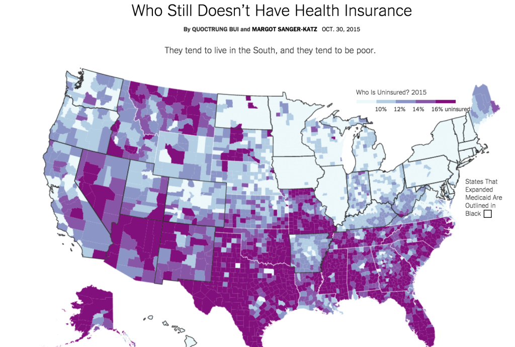
The New York Times does an amazing job at data journalism within its Upshot section. This interactive map of the uninsured, by Quotrung Bui and Margo Sanger-Katz, is pretty amazing, especially when one considers that Wisconsin, nominally a non-expansion state, already provided significant coverage overlapping with ACA. Why is Medicaid expansion important? Go to the New York Times link and see for yourself. Cross the Kentucky border into any non-expansion state. If anything, this non-population-weighted-map understates the importance of Medicaid expansion, since many of those huge purple counties out west have very few people living in them. Ninety percent of the adults who fall in the Medicaid gap live in formerly-segregated states.
PS this amazing GIF showing how patterns have changed since 2013 makes me both proud and sad regarding our country.
Great maps.
The way to correct visually for the over-representation of the empty West is to go for dot density maps, where each dot goes for 1000 uninsured people (or whatever). Example:
Strangely, rural Northern California isn't thickly populated, but has a noticeable density of blue dots. Wonder what gives.
A lot of the western states with large numbers of uninsured were also segregated. Rather than being black/white, the distinction was white/Native American.
We'll see what happens in Kentucky during the next couple years. Probably as close to a controlled experiment as you could ask for.
First of all, no I've never wondered that. Obviously having access to medical care - which can we hope be inferred from insurance — would make a huge difference to someone.
So, I think I have a cold and I'm still feeling out of it. By "formerly segregated," do you mean ex-Jim Crow areas? I thought we in the major cities, West or otherwise, were still pretty much segregated by race. Is this not true? Are things (gasp) *better* than I think they are? Wouldn't that be nice.
Don't disagree in general here, but I would note that the graphics are designed to highlight some fairly subtle distinctions. On an even 0 to 100 scale, the difference between 13.9 an 16.1 would be faint indeed; this format makes it stark. Just sayin". The point about Wisconsin is sound. For example, a rule allowing offspring on parent's policies to age 26, a key but little-hyped provision of ACA, was already implemented in Wisconsin shortly before that. The current Republican state administration has not [yet] fully trashed this stuff.