It’s not exactly a killer accusation, but Mitt Romney can’t get typography right.
Grey on grey, the slogan dissolving in the mist. Real sinew-stiffening stuff. On to Iowa! Maybe.
Do you like me think there’s also something wrong with the lettering? The EY looks squashed, like a child’s lettering running out of page.
This is not standard. Here’s the stock Times New Roman:

It’s better already, with no work.
Trying to reproduce the effect, I played around with standard serif fonts in a word processor. I failed. All the dozens of fonts available on my computer made the capital E as wide as the other letters. Somebody in the campaign put a lot of effort into getting this wrong.
That could be Romney’s alternate motto.
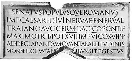
PS: For comparison, the Roman Emperor Trajan’s inscription on his column.

A touch of the running-out-of place problem on the right, but TRAIANO is spot on and the AVG is nicely kerned.
